Mobile Friendly via CSS
Mobile use has quickly overtaken half of most web traffic, and while here at Neocities we often like to recreate that desktop-only approach, it may not be as hard as you think to get it looking okay on a smaller device (assuming you didn't use frames).
There's a few things we'll need to add in order to make things look a little better on a smaller screen. Back maybe 10 years ago, I would simply set the viewport and hope for the best. Sometimes I'd try to make things a little more generic so they would then fall into place based on the browser's preference. This worked for some simple pages, but not as much once they became a little more involved. Later on I started creating separate pages for mobile, then using some browser data to determine if the user was on mobile, the finally bounce them to the correct page. This worked, but had the obvious downside of doubling the work. As you may have guessed, I never finished porting over all of the pages, so large sections of the site were left out. This was on a site where most of the content was database driven, so I didn't even have to maintain the pages. It would be even worse if I were making a static site.
So back to the two things we'll need. The first is the viewport <meta> tag, and the second will the @media CSS query.
The viewport tells the browser how big the screen will be. On your desktop, this would be however wide your window is. But mobile
devices are fixed sizes, so it comes down to the content on the page if nothing is explicitly set. The most commonly set viewport is:
Add it into your <head> section. I lump my meta sections together for clarity.
This will probably be what you use 99% of the time. width=device-width will take into account the size of the device
currently in use, since they may vary from phones to tablets. In only a few instances have I set it to another value (for example on my text
adventure page, my text block was 610 pixels, so I set the viewport to 640px in order to avoid zooming in too far).
The initial-scale=1, maximum-scale=1 part tells the browser to then zoom into whatever width has been set, and then to also
prevent any further zooming. If the page is styled correctly, there should no longer be a need to pinch-zoom to enlarge anything, and
that's what we're trying to avoid by doing all this.
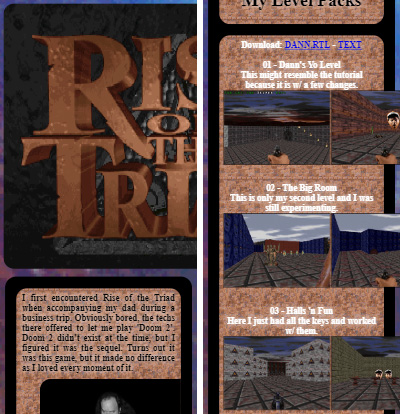
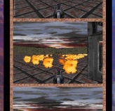
Here's a sample of my ROTT page in a desktop browser:

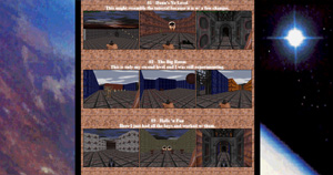
The mobile version without doing anything extra, more or less looks the same minus the margins, but all that text is really really small. Since the main content was about 640px wide, it chose that as a default viewport, and zoomed in to fit it all. After adding the device-width viewport from above, we get the proper size, but we also see some issues that need to be addressed:
The good news is that the default text is larger and more legible, and the any <div> tags hug the screen width by default.
But the good parts end there, and we're left with a few things that don't play as nice, mainly images and any sort of tables or grids.
Images are an easy fix, and we don't even have to deal with the mobile specific CSS at this point. While still in the <head>
section, add:
If you are using any shared .css files across your pages, you may also add it there (for example the default Neocities /style.css file).
It's a good catch-all and I can't think of a reason why we would want any images to be jumping out of their containers.
It won't affect any default widths and it also takes into account images within tables and <div> blocks.
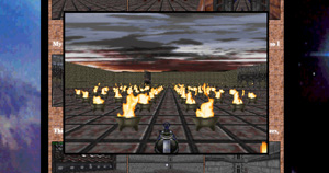
This simple change made the header image look perfect:
Now we have the messy business of those thumbnails. For the desktop version, I wanted to have some smaller images that grew when I hovered over them. In order to do this, I had to fix the locations and apply some transitions to the size and position. This is beyond the point of this article, so the main point is that we need to strip all that away. Luckily since I was using a pure CSS approach instead of JavaScript, I can simply not include all that code, and they will behave just like regular images that don't respond to anything.
This is where that @media query comes in: Within the <style> block add:
Before I go into what we would place in that section, let's discuss what @media is. Years ago, I would only use this for
formatting the web page for printing. Often I would want to strip out the navigation menu, change font colors to black, or remove backgrounds.
The process is more or less the same here. We're reformatting our page to consider the limitations of a small screen just as we would reformat
it to accommodate the limitations of a physical printout.
On this page I'm specifying that if the screen width is less than 640px wide, different CSS rules will apply. However all of the other previously defined CSS will still be in effect. In order to not remove out a bunch of desktop specific CSS, I will also add:
...and place anything that will only apply to screens that can handle the content. I'll end up with three main sections at this point:
(in this case my images are in a <div> container with a class of 'screens' and those are the only ones I care to target)
This way, there's some generic CSS that doesn't care about the screen size, and can just define colors and alignment, etc... On the desktop view, I can make the thumbnails small, but on the mobile they fit to the container (plus some margins).
Here's a few more examples.

My 'about' page didn't need anything other than the img { max-width:100%; } block. Since everthing
was based on percentages, it fell into place.

The mIRC page didn't need too much. I set the images to be a max of 100% and I aligned the tiled images a little better by adding a width
percentage to their parent <div>'s (which were in turn inside a parent container with a class of 'main')
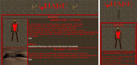
The Quake page had tables, which is usually one of the worst things for mobile since it forces a lot of horizontal space. It will adapt
to screen size, but often with the cells becoming very skinny. I was able to redefine the cells (<td> & <th>) as block elements, which forced
them onto new lines. On the desktop view I made the first column (called 'pict') a quarter of the screen, and the second (called 'desc')
was three quarters. On mobile, they are all full width. I also added a class called 'no-mobile' which I applied to anything that I wanted
hidden from view (in this case, one of the spinning quake logos). Also notice I defined my break point at 999px/1000px. I often use this
if there's not a specific central column of a certain size. It also allows you to see a desktop view on a tablet in landscape, but then
switch instantly to the mobile view if held in portrait.
So in closing, first set the viewport on your page and add the image max-width CSS. Then assess what broke. With some shuffling of the styles, you may not have to change much on the content side. Sometimes I will add some additional classes into the tags to explicitly define certain elements. That way I can address any oddball sections that don't play nice. My rule of thumb though is to try and keep it all as general as possible.
